3 Data Preparation
Data preparation is a foundational step in any data science project, ensuring that raw data is transformed into a clean and structured format suitable for analysis. This process is often the most time-consuming yet crucial stage, as the quality of data directly influences the accuracy of insights and the effectiveness of predictive models.
This chapter explores key data preparation techniques, including handling missing values, detecting outliers, transforming data, and feature engineering. By the end of this chapter, you will have a clear understanding of how to preprocess raw data, enabling robust statistical modeling and machine learning applications.
To illustrate these concepts, we will use the diamonds dataset from the ggplot2 package. This dataset contains detailed attributes of diamonds, such as carat, cut, color, clarity, and price, making it an excellent case study for data preprocessing. In this chapter, we focus on the first two steps of the Data Science Workflow—data cleaning and transformation—laying the groundwork for further analysis in subsequent chapters.
3.1 Problem Understanding
Before preparing data for analysis, it is essential to define the problem and establish clear objectives. In this case, we aim to analyze the diamonds dataset to gain insights into diamond pricing, a critical factor in industries such as jewelry retail, gemology, and e-commerce. The dataset includes attributes that influence diamond value, allowing us to explore the key factors affecting pricing.
Objectives and Key Questions
Our primary objectives with the diamonds dataset are to:
-
Examine relationships between diamond attributes (e.g., carat, cut, color, clarity) and price.
-
Identify patterns that could improve price estimation.
- Assess data quality, ensuring consistency and detecting missing values or outliers that may affect analysis.
To achieve these objectives, we will address key questions such as:
- Which attributes have the most significant influence on price?
- Are there pricing trends based on characteristics such as carat weight or cut quality?
- Are there inconsistencies, errors, or missing values that need to be corrected?
Framing the Problem as a Data Science Task
From a business perspective, understanding diamond pricing can provide valuable insights for jewelers, e-commerce platforms, and gemologists. From a data science perspective, this problem can be approached in two ways:
-
Predictive modeling: Developing a model that estimates diamond price based on its attributes.
- Exploratory data analysis (EDA): Identifying trends and relationships without building a predictive model.
Clearly defining these objectives ensures that our data preparation efforts align with the intended analytical approach, whether for exploratory insights or building robust predictive models that generalize well to unseen data. This structured problem framing will guide decisions during data cleaning, transformation, and feature engineering, ensuring that our analysis remains focused and actionable.
3.2 diamonds Dataset Overview
The diamonds dataset, included in the ggplot2 package, provides structured information on various characteristics of diamonds. Each row represents a unique diamond, with 54,940 entries in total, and contains 10 descriptive variables, including price, carat, cut, clarity, and color. The goal of our analysis is to gain deeper insights into the factors that influence diamond pricing, understand the distribution of data across these attributes, and explore both quantitative and qualitative relationships between variables.
To use the diamonds dataset in R, first ensure that the ggplot2 package is installed. If not, install it using:
install.packages("ggplot2") Then, load the package and dataset:
To inspect the dataset structure, use:
str(diamonds)
   tibble [53,940 × 10] (S3: tbl_df/tbl/data.frame)
    $ carat  : num [1:53940] 0.23 0.21 0.23 0.29 0.31 0.24 0.24 0.26 0.22 0.23 ...
    $ cut    : Ord.factor w/ 5 levels "Fair"<"Good"<..: 5 4 2 4 2 3 3 3 1 3 ...
    $ color  : Ord.factor w/ 7 levels "D"<"E"<"F"<"G"<..: 2 2 2 6 7 7 6 5 2 5 ...
    $ clarity: Ord.factor w/ 8 levels "I1"<"SI2"<"SI1"<..: 2 3 5 4 2 6 7 3 4 5 ...
    $ depth  : num [1:53940] 61.5 59.8 56.9 62.4 63.3 62.8 62.3 61.9 65.1 59.4 ...
    $ table  : num [1:53940] 55 61 65 58 58 57 57 55 61 61 ...
    $ price  : int [1:53940] 326 326 327 334 335 336 336 337 337 338 ...
    $ x      : num [1:53940] 3.95 3.89 4.05 4.2 4.34 3.94 3.95 4.07 3.87 4 ...
    $ y      : num [1:53940] 3.98 3.84 4.07 4.23 4.35 3.96 3.98 4.11 3.78 4.05 ...
    $ z      : num [1:53940] 2.43 2.31 2.31 2.63 2.75 2.48 2.47 2.53 2.49 2.39 ...
This function reveals that the dataset has 53940 observations and 10 variables. Below is a summary of the key attributes:
-
price: price in US dollars ($326–$18,823). -
carat: weight of the diamond (0.2–5.01). -
cut: quality of the cut (Fair, Good, Very Good, Premium, Ideal). -
color: diamond color, from D (best) to J (worst). -
clarity: a measurement of how clear the diamond is (I1 (worst), SI2, SI1, VS2, VS1, VVS2, VVS1, IF (best)). -
x: length in mm (0–10.74). -
y: width in mm (0–58.9). -
z: depth in mm (0–31.8). -
depth: total depth percentage =2 * z / (x + y). -
table: width of the top of the diamond relative to its widest point.
Types of Features in the diamonds Dataset
Understanding the types of features in the dataset is essential for determining the appropriate data preparation steps:
-
Quantitative (or Numerical) Variables: These are represented by numbers and can be continuous or discrete.
-
Continuous Variables: These variables can take any value within a range. In this dataset,
carat,price,x,y,z, anddepthare continuous. - Discrete Variables: These variables take countable values, often integers. For example, a count of customers or the number of purchases would be discrete, though this dataset doesn’t include such a variable.
-
Continuous Variables: These variables can take any value within a range. In this dataset,
-
Categorical (or Qualitative) Variables: These describe data that fits into categories rather than having a numerical value. They are divided into three types:
-
Ordinal Variables: Categorical variables with a meaningful order, but where the intervals between categories are not equal. For instance,
cut,color, andclarityare ordinal variables in this dataset. The ordering of levels in these variables (e.g., from “Fair” to “Ideal” incut) has meaning. - Nominal Variables: Categorical variables without any intrinsic ordering among categories. In other datasets, examples might include “gender” or “product type,” but the diamonds dataset does not contain any nominal variables.
- Binary Variables: Variables with only two levels, often coded as 0 and 1. While the diamonds dataset doesn’t contain binary variables, an example could be a feature like “has_certificate” with values “yes” or “no.”
-
Ordinal Variables: Categorical variables with a meaningful order, but where the intervals between categories are not equal. For instance,
Knowing the type of each feature guides decisions about data preparation. For instance: - Numerical variables can be normalized or standardized using techniques like Min-Max Scaling or Z-score Scaling. - Ordinal variables may be encoded using ordinal encoding or one-hot encoding, depending on whether the model should recognize the order. - Categorical variables without a meaningful order are typically one-hot encoded.
By understanding the types of variables in the diamonds dataset, we can select appropriate transformations and encoding methods to prepare the data effectively for analysis and modeling.
Key Considerations for Data Preparation
With our objectives in mind, here are the main priorities for preparing this dataset:
- Data Quality: Ensure that the data is accurate, consistent, and free from major issues. This involves checking for missing values, outliers, and inconsistencies that could bias our analysis.
- Feature Engineering: Explore the possibility of creating new features to improve predictive accuracy. For instance, calculating volume (using the product of x, y, and z dimensions) could provide an additional measure of a diamond’s size.
- Data Transformation: Ensure that all features are in appropriate formats. Categorical variables like cut and color may need to be converted into numeric codes or dummy variables to work with machine learning algorithms effectively.
3.3 Outliers
Outliers are data points that significantly deviate from the general distribution of a dataset. They can arise due to measurement variability, data entry errors, or genuinely unique observations. Identifying and handling outliers is crucial, as they can skew statistical analyses, affect model performance, and lead to misleading insights.
Outliers play a critical role in multiple industries:
- Finance: Outliers in transaction data can indicate fraud. Detecting unusually high spending patterns is key to fraud detection models.
- Healthcare: Medical records often contain anomalous lab results, which may indicate rare diseases or measurement errors.
- Manufacturing: Sensors in factories may detect equipment failures through unusual temperature spikes.
In many cases, outliers are not errors but signals of important events. Understanding their role in data analysis ensures that we don’t remove valuable insights unintentionally.
Identifying Outliers Using Visualization Techniques
Boxplots: Detecting Extreme Values
Boxplots are a visual tool for detecting extreme values. Below is a boxplot of the y variable (diamond width) by using the ggplot() and geom_boxplot() functions from the ggplot2 package:
ggplot(data = diamonds) +
    geom_boxplot(mapping = aes(y = y))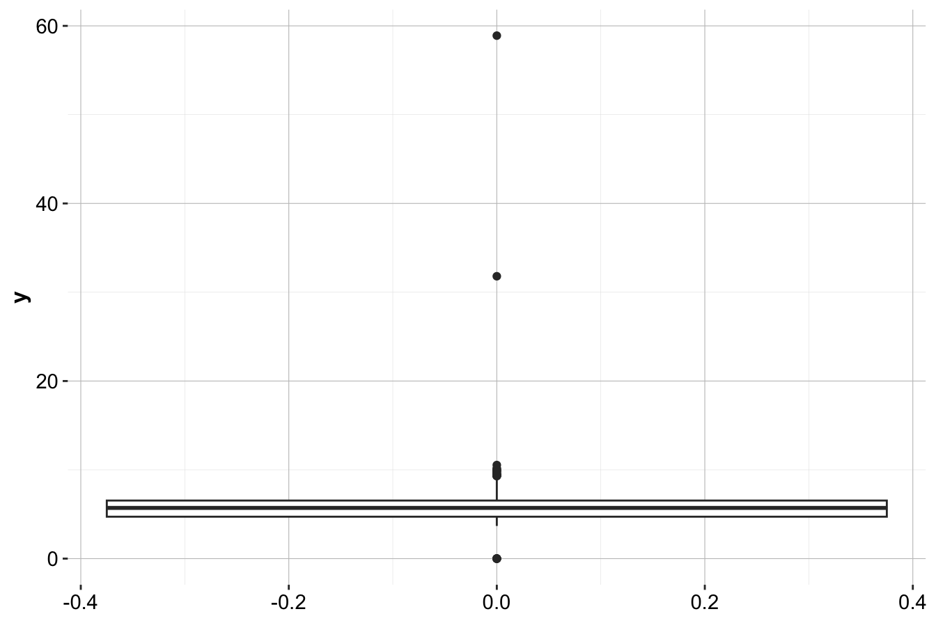
Here, boxplots highlight values beyond the whiskers, which may indicate potential outliers. Since diamonds cannot have a width of 0 mm, values like 32 mm or 59 mm likely result from data entry errors.
Histograms: Understanding Outlier Distribution
Histograms provide another visual approach to detecting outliers by displaying the frequency distribution of values. Below is a histogram of the y variable by using the ggplot() and geom_histogram() functions:
ggplot(data = diamonds) +
    geom_histogram(aes(x = y), binwidth = 0.5, color = 'blue', fill = "lightblue")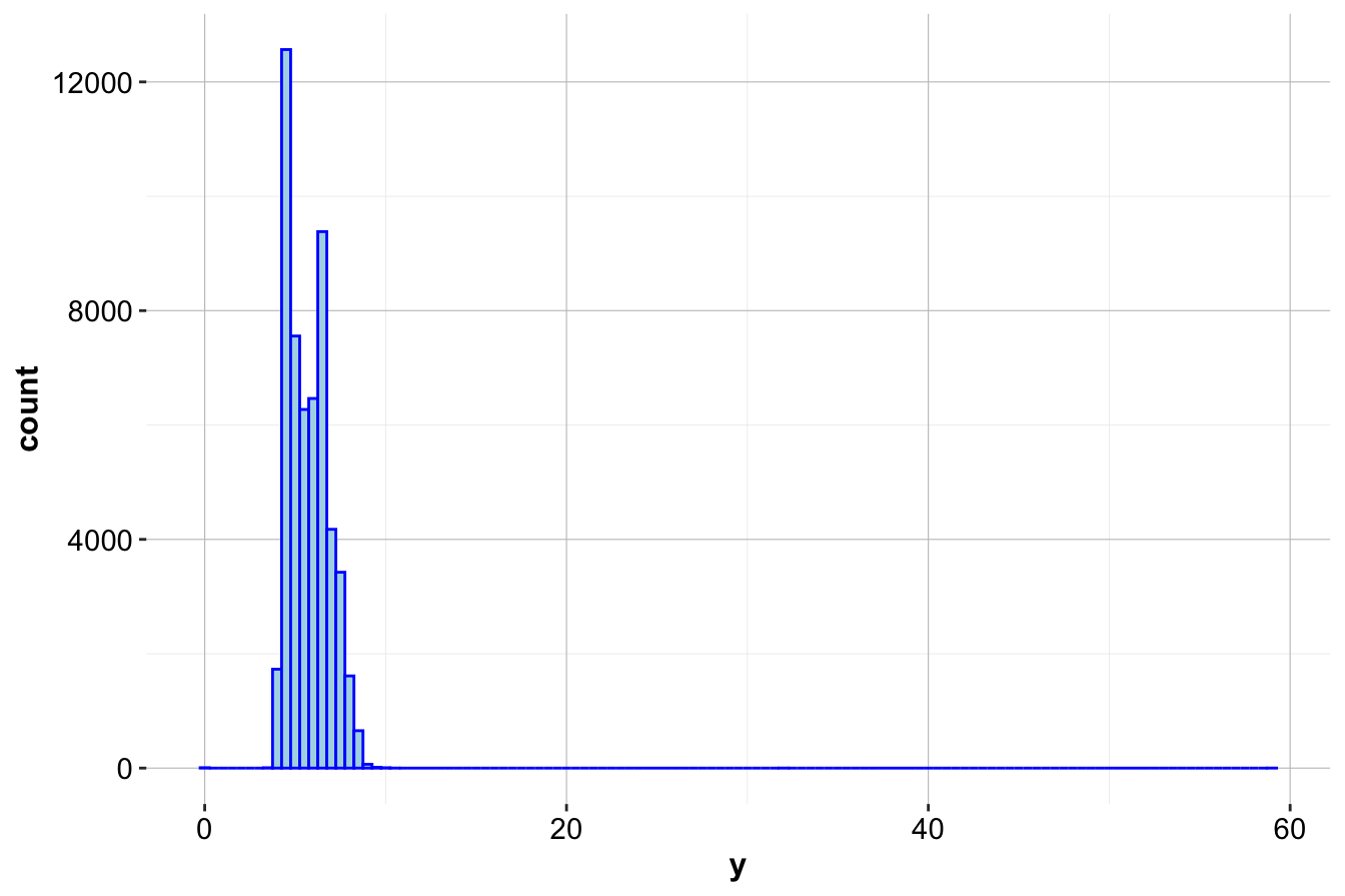
To enhance visibility, we can zoom in on smaller frequencies by using the coord_cartesian() function from the ggplot2 package:
ggplot(data = diamonds) +
    geom_histogram(mapping = aes(x = y), binwidth = 0.5, color = 'blue', fill = "lightblue") +
    coord_cartesian(ylim = c(0, 30))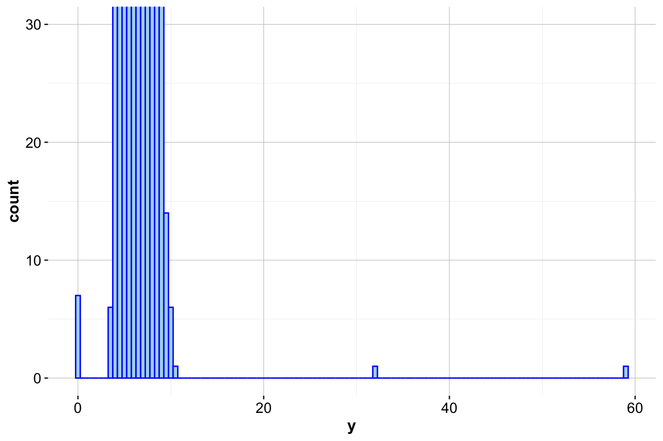
Other useful visualization techniques include:
- Violin plots – Show both outliers and density distributions.
- Density plots – Provide smoother insights into rare values and multimodal distributions.
Handling Outliers: Best Practices
Once outliers are identified, there are several strategies for handling them:
- Removing outliers: This is appropriate when an outlier is clearly an error (e.g., negative height, duplicate data entry).
- Transforming values: Techniques such as log transformation or square root scaling can reduce the influence of extreme values while preserving trends.
- Winsorization: Instead of removing outliers, replace them with the nearest percentile-based value (e.g., capping extreme values at the 95th percentile).
- Using robust statistical methods: Some algorithms, like median-based regression or random forests, are less sensitive to outliers.
- Treating outliers as a separate category: In fraud detection or rare event prediction, outliers may contain valuable insights and should not be removed.
Choosing the right strategy depends on the context of the analysis and the potential impact of the outlier.
Expanded Code Example: Handling Outliers in R
After detecting outliers, we can choose to either replace them with NA values or remove them. For this, we could consider using the mutate() function from the dplyr package. Here’s an example of treating outliers as missing values using mutate() and ifelse():
diamonds_2 <- mutate(diamonds, y = ifelse(y == 0 | y > 30, NA, y))Here’s how to verify the update:
summary(diamonds_2$y)
      Min. 1st Qu.  Median    Mean 3rd Qu.    Max.    NA's
     3.680   4.720   5.710   5.734   6.540  10.540       9
This method ensures that outliers do not distort the dataset while allowing for further imputation or analysis.
3.4 Missing Values
Missing values pose significant challenges in data analysis, as they can lead to biased results, reduce statistical power, and impact the performance of machine learning models. When handling missing data, we typically consider two approaches:
- Imputation: Replacing missing values with estimated values to retain data integrity.
- Removal: Deleting records with missing values, though this may lead to data loss and potential bias.
Imputation Techniques
There are several strategies for imputing missing values, each with different use cases:
- Mean, median, or mode imputation: Replaces missing values with the mean, median, or mode of the corresponding column.
- Random sampling: Fills missing values with random observations drawn from the existing data distribution.
- Predictive imputation: Uses machine learning models such as regression or k-nearest neighbors to estimate missing values.
- Multiple imputation: Generates several possible values for missing entries and averages the results to reduce uncertainty.
### Example: Random Sampling Imputation in R {-}
To impute missing values in y using random sampling, we use the impute() function from the Hmisc package:
diamonds_2$y <- impute(diamonds_2$y, "random")The impute() function replaces missing values with randomly sampled values from the existing distribution of y, maintaining the overall statistical properties of the dataset.
Best Practices
- Use mean or median imputation for numerical variables when the missing values are missing at random (MAR).
- Use mode imputation for categorical variables.
- Consider predictive models when the dataset is large and missing values are not completely random.
- Always assess the proportion of missing data—if too many values are missing, removing the variable may be a better approach than imputation.
3.5 Feature Scaling
Feature scaling, also known as normalization or standardization, is a crucial step in data preprocessing. It adjusts the range and distribution of numerical features so they are on a similar scale. Many machine learning algorithms, especially those based on distance metrics such as k-nearest neighbors, benefit significantly from scaled input features, as this prevents variables with larger ranges from disproportionately influencing the model’s outcome.
For instance, in the diamonds dataset, the carat variable ranges from 0.2 to 5, while price ranges from 326 to 18823. Without scaling, variables like price with a wider range can dominate the model’s predictions, potentially leading to suboptimal results. To address this, we apply feature scaling techniques to bring all numeric variables onto a comparable scale. In this section, we explore two common scaling methods:
- Min-Max Scaling: Also known as min-max normalization or min-max transformation.
- Z-score Scaling: Also known as standardization or Z-score normalization.
Feature scaling provides several benefits:
- Improved Model Performance: Ensures that features contribute equally to the model, preventing features with larger numerical ranges from dominating learning algorithms.
- Better Model Convergence: Particularly useful for gradient-based optimization methods such as logistic regression and neural networks.
- More Effective Distance-Based Learning: Algorithms such as k-means clustering and support vector machines rely on distance calculations, making feature scaling essential.
- Consistent Feature Interpretation: By standardizing numerical values, models become easier to compare and interpret.
However, feature scaling also has some drawbacks:
- Potential Loss of Information: In some cases, scaling can obscure meaningful differences between data points.
- Impact on Outliers: Min-max scaling, in particular, is sensitive to extreme values, which can distort the scaled representation.
- Additional Computation: Scaling adds preprocessing overhead, particularly when working with large datasets.
- Reduced Interpretability: The original units of measurement are lost, making it harder to relate scaled values to real-world meanings.
Selecting the right scaling method depends on the characteristics of the data and the requirements of the model. In the next sections, we will explore these methods in more detail and apply them to the diamonds dataset.
3.6 Min-Max Scaling
Min-Max Scaling transforms the values of a feature to a fixed range, typically \([0, 1]\). This transformation ensures that the minimum value of each feature becomes 0 and the maximum value becomes 1. It is especially useful for algorithms that rely on distance metrics, as it equalizes the contributions of all features, making comparisons more balanced.
The formula for Min-Max Scaling is:
\[ x_{\text{scaled}} = \frac{x - x_{\text{min}}}{x_{\text{max}} - x_{\text{min}}}, \] where \(x\) is the original feature value, \(x_{\text{min}}\) and \(x_{\text{max}}\) are the minimum and maximum values of the feature, and \(x_{\text{scaled}}\) is the scaled value, ranging between 0 and 1.
Min-Max Scaling is particularly useful for models that require bounded input values, such as neural networks and algorithms relying on gradient-based optimization. However, this method is sensitive to outliers, as extreme values significantly affect the scaled distribution.
Example 3.1 To demonstrate Min-Max Scaling, we’ll apply it to the carat variable in the diamonds dataset, where carat values range from approximately 0.2 to 5. Using the minmax() function from the liver package, we can scale carat values to fit within the range [0, 1].
ggplot(data = diamonds) +
  geom_histogram(mapping = aes(x = carat), bins = 30,
                 color = 'blue', fill = "lightblue") +
  ggtitle("Histogram for `carat` without scaling") +
  xlab("Values for variable `carat`")

ggplot(data = diamonds) +
  geom_histogram(mapping = aes(x = minmax(carat)), bins = 30,
                 color = 'blue', fill = "lightblue") +
  ggtitle("Histogram for `carat` with Min-Max Scaling") +
  xlab("Values for variable `carat`")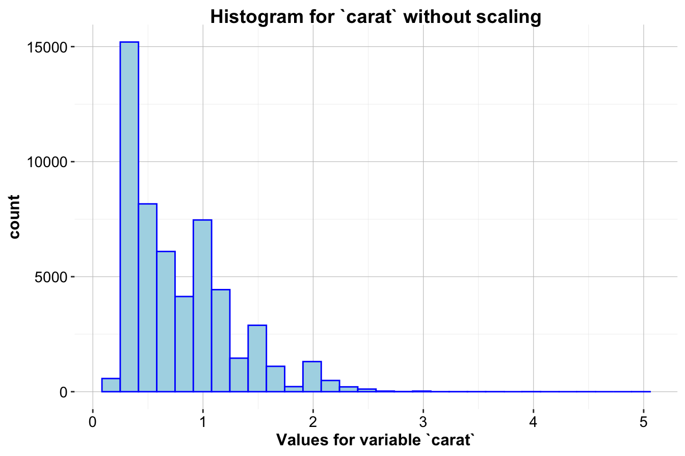
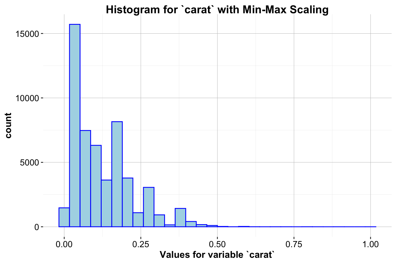
The first histogram (left) shows the distribution of carat without scaling, while the second histogram (right) shows it after Min-Max Scaling. After scaling, the carat values are compressed to a range between 0 and 1, allowing it to be more comparable to other features that may have different original scales. This scaling method is particularly beneficial for distance-based algorithms, as it prevents features with wider ranges from having undue influence.
3.7 Z-score Scaling
Z-score Scaling, also known as standardization, transforms feature values so they have a mean of 0 and a standard deviation of 1. This method is particularly useful for algorithms that assume normally distributed data, such as linear regression and logistic regression, because it centers the data around 0 and normalizes the spread of values.
The formula for Z-score Scaling is:
\[ x_{\text{scaled}} = \frac{x - \text{mean}(x)}{\text{sd}(x)} \]
where \(x\) is the original feature value, \(\text{mean}(x)\) is the mean of the feature, \(\text{sd}(x)\) is the standard deviation of the feature, and \(x_{\text{scaled}}\) is the standardized value, now having a mean of 0 and a standard deviation of 1.
Z-score Scaling is particularly beneficial for models that assume normality or use gradient-based optimization, ensuring that all numerical features contribute equally. However, since it relies on mean and standard deviation, it is sensitive to outliers, which can distort the transformation.
Example 3.2 Applying Z-score Scaling to the carat variable in the diamonds dataset, where the mean and standard deviation of carat are approximately 0.8 and 0.47, respectively. We use the zscore() function from the liver package to standardize these values.
ggplot(data = diamonds) +
  geom_histogram(mapping = aes(x = carat), bins = 30,
                 color = 'blue', fill = "lightblue") +
  ggtitle("Histogram for `carat` without scaling") +
  xlab("Values for variable `carat`")

ggplot(data = diamonds) +
  geom_histogram(mapping = aes(x = zscore(carat)), bins = 30,
                 color = 'blue', fill = "lightblue") +
  ggtitle("Histogram for `carat` with Z-score Scaling") +
  xlab("Values for variable `carat`")
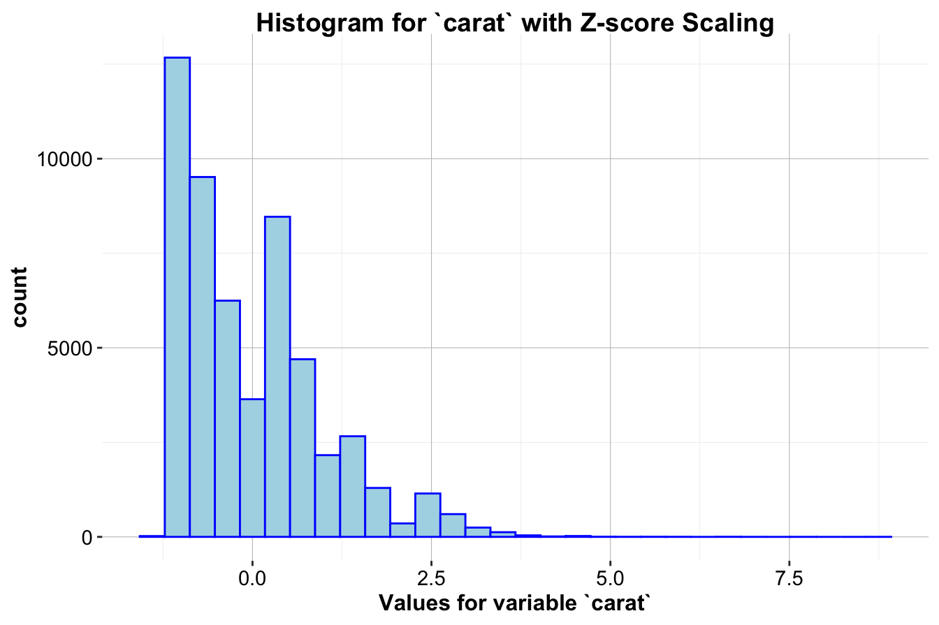
The first histogram (left) displays the distribution of carat without scaling, while the second histogram (right) shows the distribution after Z-score Scaling. This transformation makes feature values comparable across different scales and ensures that each feature contributes equally to distance-based computations and model training.
Note: A common misconception is that after Z-score Scaling, the data follows a standard normal distribution. While Z-score Scaling centers the data to a mean of 0 and scales it to a standard deviation of 1, it does not alter the shape of the distribution. If the original distribution is skewed, it will remain skewed after scaling, as seen in the histograms above.
The choice between Min-Max Scaling and Z-score Scaling depends on the requirements of the model and the characteristics of the data. Min-Max Scaling is preferable for algorithms that require a fixed input range, while Z-score Scaling is better suited for models that assume normally distributed features. By selecting the appropriate scaling method, we ensure balanced feature contributions and improved model performance.
3.8 How to Reexpress Categorical Field Values
In data science, categorical features often need to be transformed into a numeric format before they can be used in machine learning models. Algorithms like decision trees, neural networks, and linear regression require numeric inputs to process the data effectively. Converting categorical variables into numerical representations ensures that all features contribute appropriately to the model, rather than being ignored or treated incorrectly.
This process of reexpressing categorical values is a crucial part of data preparation, as it enables us to leverage the full range of features in our dataset. In this section, we explore several methods to convert categorical fields into numeric representations, with a focus on techniques like one-hot encoding and ordinal encoding. We demonstrate these techniques using the diamonds dataset, which includes several categorical features such as cut, color, and clarity.
3.8.1 Why Reexpress Categorical Fields?
Categorical fields, also known as nominal or ordinal variables, often represent qualitative aspects of data, such as product types, user locations, or levels of satisfaction. In the diamonds dataset, for example:
-
cutindicates the quality of the diamond’s cut (e.g., “Fair,” “Good,” “Very Good,” “Premium,” “Ideal”). -
colorrepresents the diamond’s color grade (e.g., “D,” “E,” “F,” with “D” being the most colorless and thus most valuable). -
claritydescribes the diamond’s clarity, reflecting the absence of internal or external flaws.
These fields are essential for understanding and predicting diamond pricing, but in their raw form as text labels, they are not suitable for most machine learning algorithms. Transforming them into numeric form allows us to include these valuable insights in our analysis.
3.8.2 Techniques for Reexpressing Categorical Variables
There are several approaches to converting categorical variables into numeric representations. The method we choose depends on the type of categorical variable and the nature of the data.
Ordinal Encoding
Ordinal encoding is suitable when the categorical variable has a meaningful order. For example, the cut feature in the diamonds dataset is ordinal, as there is a natural hierarchy from “Fair” to “Ideal.” In ordinal encoding, each category is assigned a unique integer based on its rank or level of importance.
In this example, we might assign values as follows:
- “Fair” → 1
- “Good” → 2
- “Very Good” → 3
- “Premium” → 4
- “Ideal” → 5
This approach preserves the order of the categories, which can be useful in models that interpret numeric values in a relative way, such as linear regression. However, it is important to apply ordinal encoding only when the order is meaningful. For non-ordinal variables, other methods like one-hot encoding are more appropriate.
One-Hot Encoding
One-hot encoding is the preferred technique for nominal variables—categorical fields without an intrinsic order. In this approach, each unique category in a field is transformed into a new binary (0 or 1) feature. This method is particularly useful for variables like color and clarity in the diamonds dataset, where the categories do not follow a clear sequence.
For example, if we one-hot encode the color feature, we create a set of binary columns, one for each color grade:
-
color_D: 1 if the diamond color is “D,” 0 otherwise. -
color_E: 1 if the diamond color is “E,” 0 otherwise. -
color_F: 1 if the diamond color is “F,” 0 otherwise.
One-hot encoding avoids introducing false ordinal relationships, ensuring that the model treats each category as an independent entity. However, one downside is that it can significantly increase the dimensionality of the dataset if the categorical field has many unique values.
Note: Many machine learning libraries automatically drop one of the binary columns to avoid multicollinearity (perfect correlation among features). For instance, if we have seven color categories, only six binary columns are created, and the missing category is implied when all columns are zero. This approach, known as dummy encoding, helps avoid redundancy and keeps the model simpler.
Frequency Encoding
Another useful approach, especially for high-cardinality categorical variables (those with many unique values), is frequency encoding. This technique replaces each category with its frequency in the dataset, allowing the model to capture information about how common each category is. Frequency encoding can be particularly helpful for fields like clarity if you want to give the model an indication of how prevalent each level is.
For example:
- If “VS2” appears 10,000 times in the dataset, it would be encoded as 10,000.
- If “IF” appears only 500 times, it would be encoded as 500.
Frequency encoding is less commonly used in basic machine learning workflows but can be valuable when dealing with very large datasets, or when one-hot encoding would introduce too many columns. However, be cautious with this approach, as it may inadvertently add an implicit weight to more common categories.
3.8.3 Choosing the Right Encoding Technique
Selecting the appropriate encoding technique depends on the nature of your categorical variable and the requirements of your analysis:
- Ordinal variables (like
cut): Use ordinal encoding to preserve the natural order. - Nominal variables with few unique values (like
colorandclarity): Use one-hot encoding to represent each category as a binary column. - High-cardinality categorical variables: Consider frequency encoding if one-hot encoding would introduce too many features.
Example 3.3 Applying these techniques to the diamonds dataset:
# Example: Ordinal encoding for `cut`
diamonds <- diamonds %>%
  mutate(cut_encoded = as.integer(factor(cut, levels = c("Fair", "Good", "Very Good", "Premium", "Ideal"))))

# Example: One-hot encoding for `color`
diamonds <- diamonds %>%
  mutate(
    color_D = ifelse(color == "D", 1, 0),
    color_E = ifelse(color == "E", 1, 0),
    color_F = ifelse(color == "F", 1, 0),
    color_G = ifelse(color == "G", 1, 0),
    color_H = ifelse(color == "H", 1, 0),
    color_I = ifelse(color == "I", 1, 0),
    color_J = ifelse(color == "J", 1, 0)
  )
In this example:
- Ordinal Encoding: We have encoded the
cutvariable based on its quality hierarchy. - One-Hot Encoding: We have applied one-hot encoding to
color, creating binary columns for each color grade.
By encoding the categorical fields in this way, we transform the dataset into a format compatible with most machine learning algorithms while preserving the essential information about each categorical feature.
With our dataset now cleaned, scaled, and encoded, we are ready to move into the next stage of data analysis. In the upcoming chapter, we will explore Exploratory Data Analysis (EDA), where we will use visualizations and summary statistics to gain insights into the structure and relationships within the data. By combining the prepared data with EDA techniques, we can better understand which features may hold predictive value for our model and set the stage for successful machine learning outcomes.
3.9 Case Study: Who Can Earn More Than $50K Per Year?
In this case study, we will explore the Adult dataset, sourced from the US Census Bureau. This dataset contains demographic information about individuals, including age, education, occupation, and income. The dataset is available in the liver package. For more details, refer to the documentation.
The goal of this study is to predict whether an individual earns more than $50,000 per year based on their attributes. In Section 11.5 of Chapter 11, we will apply decision tree and random forest algorithms to build a predictive model. Before applying these techniques, we need to preprocess the dataset by handling missing values, encoding categorical variables, and scaling numerical features. Let’s begin by loading the dataset and examining its structure.
Overview of the Dataset
To use the Adult dataset, first ensure that the liver package is installed. If not, install it using:
install.packages("liver")Next, load the package and dataset:
To inspect the dataset structure, use:
str(adult)
   'data.frame':    48598 obs. of  15 variables:
    $ age           : int  25 38 28 44 18 34 29 63 24 55 ...
    $ workclass     : Factor w/ 6 levels "?","Gov","Never-worked",..: 4 4 2 4 1 4 1 5 4 4 ...
    $ demogweight   : int  226802 89814 336951 160323 103497 198693 227026 104626 369667 104996 ...
    $ education     : Factor w/ 16 levels "10th","11th",..: 2 12 8 16 16 1 12 15 16 6 ...
    $ education.num : int  7 9 12 10 10 6 9 15 10 4 ...
    $ marital.status: Factor w/ 5 levels "Divorced","Married",..: 3 2 2 2 3 3 3 2 3 2 ...
    $ occupation    : Factor w/ 15 levels "?","Adm-clerical",..: 8 6 12 8 1 9 1 11 9 4 ...
    $ relationship  : Factor w/ 6 levels "Husband","Not-in-family",..: 4 1 1 1 4 2 5 1 5 1 ...
    $ race          : Factor w/ 5 levels "Amer-Indian-Eskimo",..: 3 5 5 3 5 5 3 5 5 5 ...
    $ gender        : Factor w/ 2 levels "Female","Male": 2 2 2 2 1 2 2 2 1 2 ...
    $ capital.gain  : int  0 0 0 7688 0 0 0 3103 0 0 ...
    $ capital.loss  : int  0 0 0 0 0 0 0 0 0 0 ...
    $ hours.per.week: int  40 50 40 40 30 30 40 32 40 10 ...
    $ native.country: Factor w/ 42 levels "?","Cambodia",..: 40 40 40 40 40 40 40 40 40 40 ...
    $ income        : Factor w/ 2 levels "<=50K",">50K": 1 1 2 2 1 1 1 2 1 1 ...
The dataset contains 48598 records and 15 variables. Of these, 14 are predictors, while the target variable, income, is a categorical variable with two levels: <=50K and >50K. The features include both numerical and categorical variables:
-
age: Age in years (numerical).
-
workclass: Employment type (categorical, 6 levels).
-
demogweight: Census weighting factor (numerical).
-
education: Highest level of education (categorical, 16 levels).
-
education.num: Number of years of education (numerical).
-
marital.status: Marital status (categorical, 5 levels).
-
occupation: Job category (categorical, 15 levels).
-
relationship: Family relationship status (categorical, 6 levels).
-
race: Racial background (categorical, 5 levels).
-
gender: Gender identity (categorical, Male/Female).
-
capital.gain: Capital gains (numerical).
-
capital.loss: Capital losses (numerical).
-
hours.per.week: Hours worked per week (numerical).
-
native.country: Country of origin (categorical, 42 levels).
-
income: Target variable indicating annual income (<=50Kor>50K).
For clarity, we categorize the dataset’s variables:
-
Nominal variables:
workclass,marital.status,occupation,relationship,race,native.country, andgender.
-
Ordinal variable:
education.
-
Numerical variables:
age,demogweight,education.num,capital.gain,capital.loss, andhours.per.week.
To better understand the dataset, we generate summary statistics:
summary(adult)
         age              workclass      demogweight             education
    Min.   :17.0   ?           : 2794   Min.   :  12285   HS-grad     :15750
    1st Qu.:28.0   Gov         : 6536   1st Qu.: 117550   Some-college:10860
    Median :37.0   Never-worked:   10   Median : 178215   Bachelors   : 7962
    Mean   :38.6   Private     :33780   Mean   : 189685   Masters     : 2627
    3rd Qu.:48.0   Self-emp    : 5457   3rd Qu.: 237713   Assoc-voc   : 2058
    Max.   :90.0   Without-pay :   21   Max.   :1490400   11th        : 1812
                                                          (Other)     : 7529
    education.num         marital.status            occupation
    Min.   : 1.00   Divorced     : 6613   Craft-repair   : 6096
    1st Qu.: 9.00   Married      :22847   Prof-specialty : 6071
    Median :10.00   Never-married:16096   Exec-managerial: 6019
    Mean   :10.06   Separated    : 1526   Adm-clerical   : 5603
    3rd Qu.:12.00   Widowed      : 1516   Sales          : 5470
    Max.   :16.00                         Other-service  : 4920
                                          (Other)        :14419
            relationship                   race          gender
    Husband       :19537   Amer-Indian-Eskimo:  470   Female:16156
    Not-in-family :12546   Asian-Pac-Islander: 1504   Male  :32442
    Other-relative: 1506   Black             : 4675
    Own-child     : 7577   Other             :  403
    Unmarried     : 5118   White             :41546
    Wife          : 2314

     capital.gain      capital.loss     hours.per.week        native.country
    Min.   :    0.0   Min.   :   0.00   Min.   : 1.00   United-States:43613
    1st Qu.:    0.0   1st Qu.:   0.00   1st Qu.:40.00   Mexico       :  949
    Median :    0.0   Median :   0.00   Median :40.00   ?            :  847
    Mean   :  582.4   Mean   :  87.94   Mean   :40.37   Philippines  :  292
    3rd Qu.:    0.0   3rd Qu.:   0.00   3rd Qu.:45.00   Germany      :  206
    Max.   :41310.0   Max.   :4356.00   Max.   :99.00   Puerto-Rico  :  184
                                                        (Other)      : 2507
      income
    <=50K:37155
    >50K :11443
This summary provides insights into the distribution of numerical variables, missing values, and categorical variable levels, guiding us in preparing the data for further analysis.
3.9.1 Missing Values
The summary() function reveals that the variables workclass and native.country contain missing values, represented by the "?" category. Specifically, 2794 records in workclass and 847 records in native.country have missing values. Since "?" is used as a placeholder for missing data, we first convert these entries to NA:
adult[adult == "?"] = NAAfter replacing "?" with NA, we remove unused factor levels to clean up the dataset:
adult = droplevels(adult)To visualize the distribution of missing values, we use the gg_miss_var() function from the naniar package:
library(naniar)  # Load package for visualizing missing values

gg_miss_var(adult, show_pct = TRUE)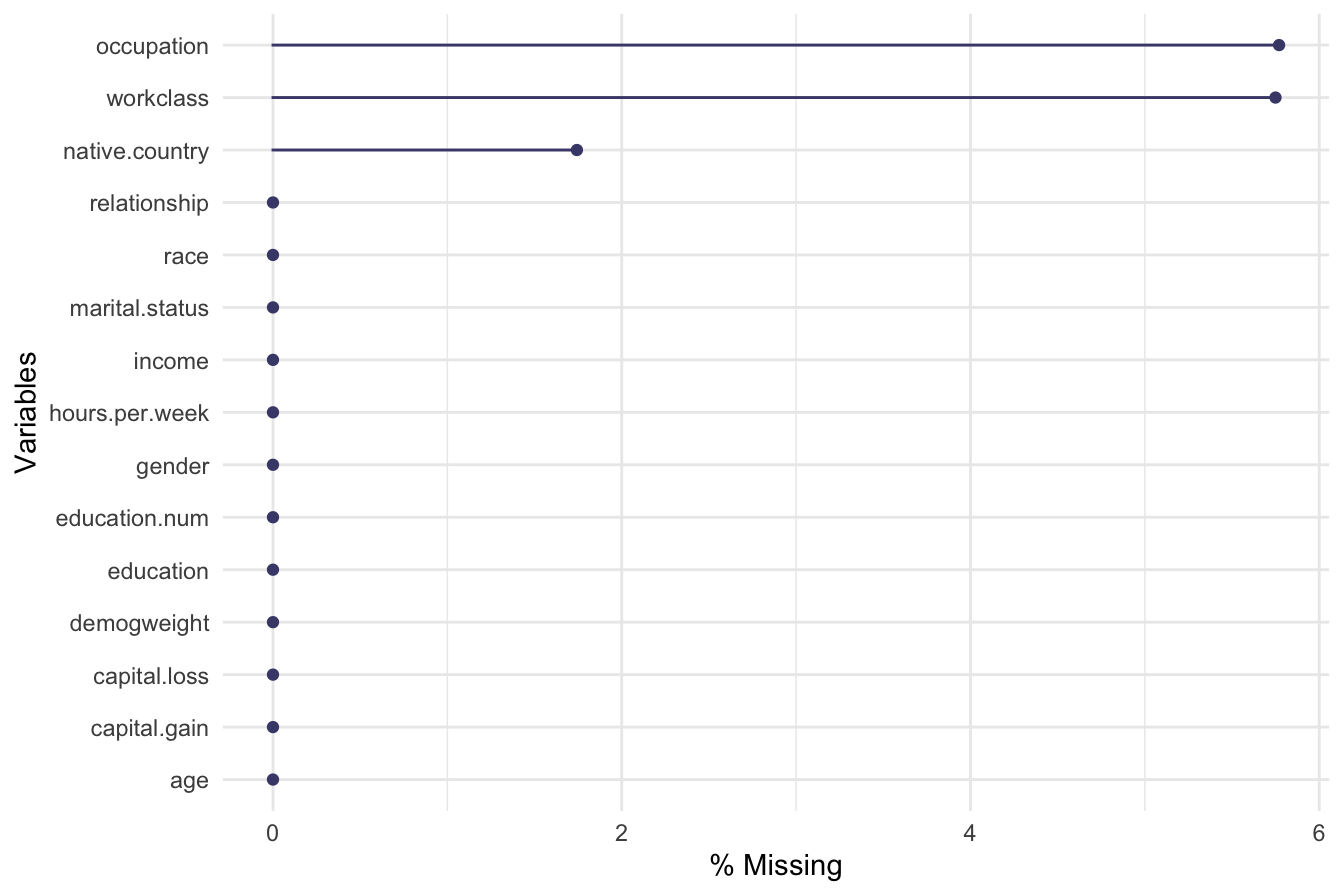
The plot indicates that workclass, occupation, and native.country contain missing values. The percentage of missing values in these variables is relatively low, with workclass and occupation having less than 0.06 percent missing data, while native.country has about 0.02 percent.
Imputing Missing Values
Instead of removing records with missing values, which can lead to information loss, we apply random imputation, where missing values are filled with randomly selected values from the existing distribution of each variable. This maintains the natural proportions of each category.
We use the impute() function from the Hmisc package for this purpose:
library(Hmisc)  # Load package for imputation

# Impute missing values using random sampling from existing categories
adult$workclass      = impute(adult$workclass,      'random')
adult$native.country = impute(adult$native.country, 'random')
adult$occupation     = impute(adult$occupation,     'random')
To confirm that missing values have been successfully imputed, we generate another missing values plot:
gg_miss_var(adult, show_pct = TRUE)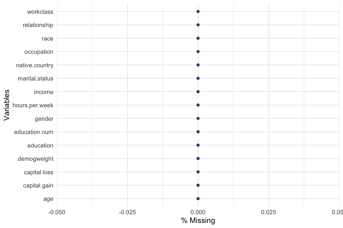
The updated plot should show no missing values, indicating successful imputation.
Alternative Approaches
The impute() function allows for different statistical methods such as mean, median, or mode imputation. Its default behavior is median imputation. For more advanced techniques, the aregImpute() function from the Hmisc package offers predictive imputation using additive regression, bootstrapping, and predictive mean matching.
Although removing records with missing values using na.omit() is an option, it is generally discouraged unless missing values are excessive or biased in a way that could distort analysis.
By properly handling missing values, we ensure data completeness and maintain the integrity of the dataset for subsequent preprocessing steps, such as recoding categorical variables and grouping country-level data into broader regions.
3.9.2 Encoding Categorical Variables
Categorical variables often contain a large number of unique values, making them challenging to use in predictive models. In the Adult dataset, native.country and workclass have multiple categories, which can introduce complexity and redundancy. To simplify these variables, we group similar categories together while preserving their interpretability.
Grouping native.country by Continent
The native.country variable contains 41 distinct countries. To make it more manageable, we categorize countries into broader geographical regions:
-
Europe: England, France, Germany, Greece, Netherlands, Hungary, Ireland, Italy, Poland, Portugal, Scotland, Yugoslavia
-
Asia: China, Hong Kong, India, Iran, Cambodia, Japan, Laos, Philippines, Vietnam, Taiwan, Thailand
-
North America: Canada, United States, Puerto Rico
-
South America: Colombia, Cuba, Dominican Republic, Ecuador, El Salvador, Guatemala, Haiti, Honduras, Mexico, Nicaragua, Outlying US territories, Peru, Jamaica, Trinidad & Tobago
-
Other: This includes the ambiguous “South” category, as its meaning is unclear in the dataset documentation.
We use thefct_collapse()function from the forcats package to reassign categories:
library(forcats)  # Load package for categorical variable transformation

# To create a new factor variable with fewer levels for `native.country`
Europe = c("England", "France", "Germany", "Greece", "Holand-Netherlands", "Hungary", "Ireland", "Italy", "Poland", "Portugal", "Scotland", "Yugoslavia")

Asia = c("China", "Hong", "India", "Iran", "Cambodia", "Japan", "Laos", "Philippines", "Vietnam", "Taiwan", "Thailand")

N.America = c("Canada", "United-States", "Puerto-Rico")

S.America = c("Columbia", "Cuba", "Dominican-Republic", "Ecuador", "El-Salvador", "Guatemala", "Haiti", "Honduras", "Mexico", "Nicaragua", "Outlying-US(Guam-USVI-etc)", "Peru", "Jamaica", "Trinadad&Tobago")

# Reclassify native.country into broader regions
adult$native.country = fct_collapse(adult$native.country,
                                    "Europe"    = Europe,
                                    "Asia"      = Asia,
                                    "N.America" = N.America,
                                    "S.America" = S.America,
                                    "Other"     = c("South") )
To confirm the changes, we display the frequency distribution of native.country:
By grouping the original 42 countries into 5 broader regions, we simplify the variable while maintaining its relevance for analysis.
Simplifying workclass
The workclass variable originally contains several employment categories. Since “Never-worked” and “Without-pay” represent similar employment statuses, we merge them into a single category labeled “Unemployed”:
adult$workclass = fct_collapse(adult$workclass, "Unemployed" = c("Never-worked", "Without-pay"))To verify the updated categories, we check the frequency distribution:
By reducing the number of unique categories in workclass and native.country, we improve model interpretability and reduce the risk of overfitting when applying machine learning algorithms.
3.9.3 Outliers
Detecting and handling outliers is an essential step in data preprocessing, as extreme values can significantly impact statistical analysis and model performance. Here, we examine potential outliers in the capital.loss variable to determine whether adjustments are necessary.
Summary Statistics
To gain an initial understanding of capital.loss, we compute its summary statistics:
The summary output reveals the following insights:
- The minimum value is 0, while the maximum is 4356.
- The median is 0, which is significantly lower than the mean, indicating a highly skewed distribution.
- More than 75% of the observations have a capital loss of 0, confirming a strong right-skew.
- The mean capital loss is 87.94, which is influenced by a small number of extreme values.
Visualizing Outliers
To further investigate the distribution of capital.loss, we use a boxplot and histogram:
ggplot(data = adult, aes(y = capital.loss)) +
     geom_boxplot()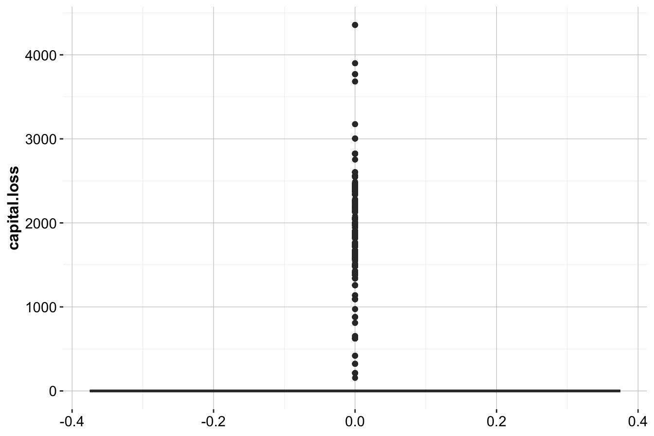
ggplot(data = adult, aes(x = capital.loss)) +
     geom_histogram(bins = 30, color = "blue", fill = "lightblue")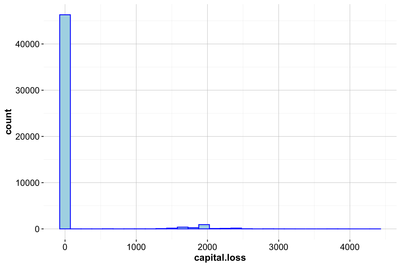
From these plots, we observe:
- The boxplot shows a strong positive skew, with many extreme values above the upper whisker.
- The histogram indicates that most observations have zero capital loss, with a few cases around 2,000 and 4,000.
Since a large proportion of observations report no capital loss, we further examine the nonzero cases.
Zooming into the Nonzero Distribution
To better visualize the spread of nonzero values, we focus on observations with capital.loss > 0:
ggplot(data = adult, mapping = aes(x = capital.loss)) +
    geom_histogram(bins = 30, color = "blue", fill = "lightblue") +
    coord_cartesian(xlim = c(500, 4000), ylim = c(0, 1000))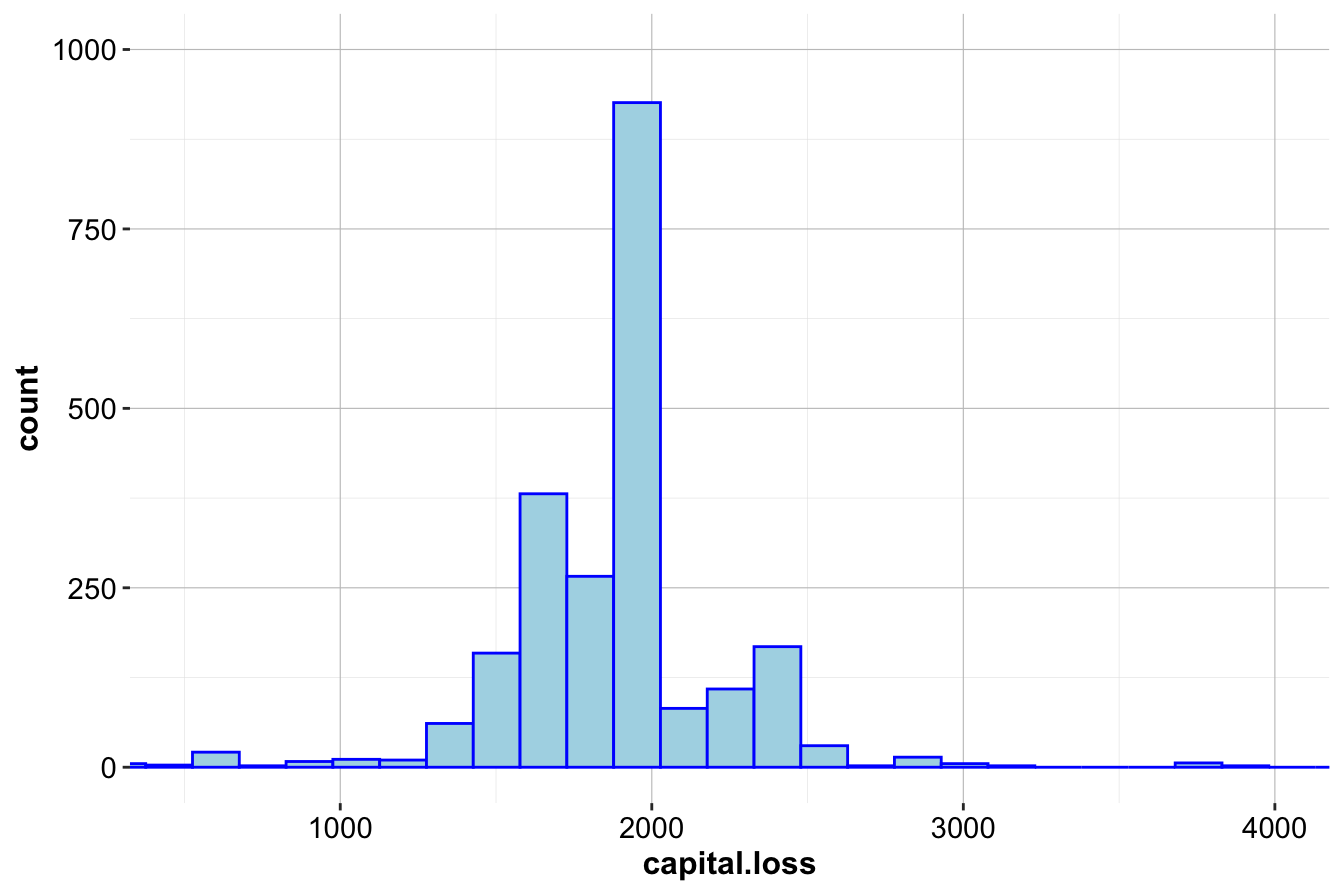
ggplot(data = subset(adult, capital.loss > 0)) +
geom_boxplot(aes(y = capital.loss)) 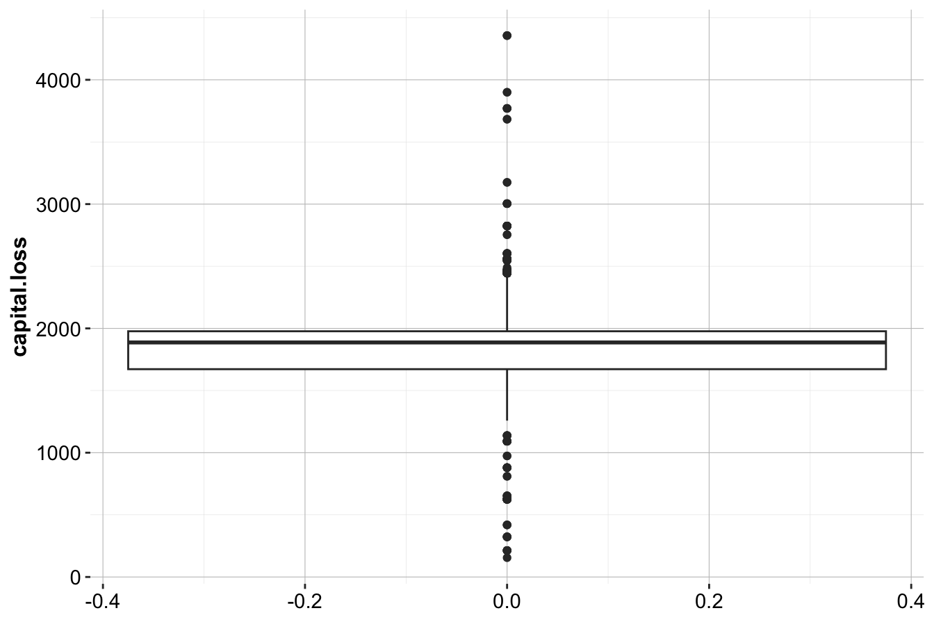
Key takeaways from these refined plots:
- The majority of nonzero values are below 500, with a small number extending beyond 4,000.
- The distribution of nonzero values is approximately symmetric, suggesting that while there are extreme values, they follow a structured pattern rather than random anomalies.
Handling Outliers
Although capital.loss contains many high values, these do not appear to be erroneous. Instead, they reflect genuine cases within the dataset. Since these values provide meaningful information about particular individuals, we retain them rather than applying transformations or removals.
However, if model performance is significantly affected by these extreme values, we might consider:
-
Winsorization: Capping values at a reasonable percentile (e.g., the 95th percentile).
-
Log Transformation: Applying a log transformation to reduce skewness.
-
Creating a Binary Indicator: Introducing a new variable indicating whether a capital loss occurred (
capital.loss > 0).
Next, we perform a similar outlier analysis for the capital.gain variable. See the exercises below for a guided approach.
3.10 Exercises
This section provides hands-on exercises to reinforce the key concepts covered in this chapter. These questions include theoretical, exploratory, and practical challenges related to data types, outliers, encoding techniques, and feature engineering.
Understanding Data Types
- What is the difference between continuous and discrete numerical variables? Provide an example of each from real-world data.
- How do ordinal categorical variables differ from nominal categorical variables? Give an example for both.
Exploring the diamonds Dataset
- Report the summary statistics for the diamonds dataset using the
summary()function. What insights can you derive from the output?
- In the diamonds dataset, which variables are nominal, ordinal, and numerical? List them accordingly.
Detecting and Handling Outliers
- Identify outliers in the variable
x. If any exist, handle them appropriately. Follow the same approach as in Section 3.3 for theyvariable in the diamonds dataset.
- Repeat the outlier detection process for the variable
z. If necessary, apply transformations or filtering techniques.
- Check for outliers in the
depthvariable. What method would you use to detect and handle them?
Encoding Categorical Variables
- The
cutvariable in the diamonds dataset is ordinal. How can we encode it properly using ordinal encoding?
- The
colorvariable in the diamonds dataset is nominal. How can we encode it using one-hot encoding?
Analyzing the Adult Dataset
- Load the Adult dataset from the liver package and examine its structure. Identify the categorical variables and classify them as nominal or ordinal.
- Compute the proportion of individuals who earn more than 50K (
>50K). What does this distribution tell you about income levels in this dataset?
- For the Adult dataset, generate the summary statistics, boxplot, and histogram for the variable
capital.gain. What do you observe?
- Based on the visualizations from the previous question, are there outliers in the
capital.gainvariable? If so, suggest a strategy to handle them.
Feature Engineering Challenge
- Create a new categorical variable
Age_Groupin the Adult dataset, grouping ages into:
- Young (≤30 years old)
- Middle-aged (31-50 years old)
- Senior (>50 years old)
Use thecut()function to implement this transformation.
- Compute the mean
capital.gainfor eachAge_Group. What insights do you gain about income levels across different age groups?
Advanced Data Preparation Challenges
In the Adult dataset, the
educationvariable contains 16 distinct levels. Reduce these categories into broader groups such as “No Diploma,” “High School Graduate,” “Some College,” and “Postgraduate.” Implement this transformation using thefct_collapse()function.The
capital.gainandcapital.lossvariables represent financial assets. Create a new variablenet.capitalthat computes the difference betweencapital.gainandcapital.loss. Analyze its distribution.Perform Min-Max scaling on the numerical variables in the Adult dataset (
age,capital.gain,capital.loss,hours.per.week). Use themutate()function to apply this transformation.Perform Z-score normalization on the same set of numerical variables. Compare the results with Min-Max scaling. In what scenarios would one approach be preferable over the other?
Construct a logistic regression model to predict whether an individual earns more than 50K (
>50K) based on selected numerical features (age,education.num,hours.per.week). Preprocess the data accordingly and interpret the coefficients of the model.