8 Model Evaluation
As we progress through the Data Science Workflow, introduced in Chapter 2 and illustrated in Figure 2.3, we have already completed the first five phases:
-
Problem Understanding: Defining the problem we aim to solve.
-
Data Preparation: Cleaning, transforming, and organizing the data for analysis.
-
Exploratory Data Analysis (EDA): Gaining insights and uncovering patterns in the data.
-
Preparing Data for Modeling: Setting up the data for modeling by scaling, encoding, and partitioning.
- Modeling: Applying algorithms to make predictions or extract insights—such as the kNN classification method we explored in the previous chapter.
Now, we arrive at the Model Evaluation phase, a pivotal step in the Data Science Workflow. This phase answers the critical question: How well does our model perform?
Building a model is just the beginning. Without evaluation, we have no way of knowing whether our model generalizes well to new data or if it is simply memorizing patterns from the training set. A model that performs well during training but fails in real-world applications is of little practical value. Model evaluation ensures that our predictions are reliable and that the model effectively captures underlying patterns rather than just noise.
This chapter will introduce key evaluation techniques and metrics to assess the performance of classification and regression models, helping us make informed decisions about model selection and improvement.
Why Is Model Evaluation Important?
Building a model is just the beginning. The real test of its effectiveness lies in its ability to generalize to new, unseen data. Without proper evaluation, a model may seem successful during development but fail when applied in real-world scenarios.
Consider this example:
You develop a model to detect fraudulent credit card transactions, and it achieves 95% accuracy. Sounds impressive, right? But if only 1% of the transactions are actually fraudulent, your model might simply classify every transaction as legitimate to achieve high accuracy—completely ignoring all fraud cases. This highlights a crucial point: accuracy alone can be misleading, especially in imbalanced datasets.
Model evaluation provides a more comprehensive understanding of a model’s performance by assessing:
-
Strengths: What the model does well (e.g., correctly detecting fraud).
-
Weaknesses: Where it falls short (e.g., missing fraudulent cases or flagging too many legitimate transactions as fraud).
- Trade-offs: The balance between competing priorities, such as sensitivity vs. specificity or precision vs. recall.
A well-evaluated model aligns with real-world objectives. It helps answer key questions such as:
- How well does the model handle imbalanced datasets?
- Is it good at identifying true positives (e.g., detecting cancer in medical diagnoses)?
- Does it minimize false positives (e.g., avoiding mistakenly flagging legitimate emails as spam)?
As George Box, a renowned statistician, famously said, “All models are wrong, but some are useful.” A model is always a simplification of reality—it cannot capture every nuance or complexity. However, through proper evaluation, we can determine whether a model is useful enough to make reliable predictions and guide decision-making.
In this chapter, we will explore the evaluation of classification models, starting with binary classification, where the target variable has two categories (e.g., spam vs. not spam). We will then discuss evaluation metrics for multi-class classification, where there are more than two categories (e.g., types of vehicles: car, truck, bike). Finally, we will introduce evaluation metrics for regression models, where the target variable is continuous (e.g., predicting house prices).
Our goal is to establish a strong foundation in model evaluation, enabling you to assess model performance effectively and make data-driven decisions. Let’s begin with one of the most fundamental tools in classification evaluation: the Confusion Matrix.
8.1 Confusion Matrix
The confusion matrix is a fundamental tool for evaluating classification models. It provides a detailed breakdown of a model’s predictions by categorizing them into four distinct groups based on actual versus predicted values. For binary classification problems, the confusion matrix is structured as shown in Table 8.1.
In classification tasks, one class is typically designated as the positive class (the class of interest), while the other is the negative class. For instance, in fraud detection, fraudulent transactions might be considered the positive class, while legitimate transactions are the negative class.
| Predicted | Positive | Negative |
|---|---|---|
| Actual Positive | True Positive (TP) | False Negative (FN) |
| Actual Negative | False Positive (FP) | True Negative (TN) |
Each element in the confusion matrix corresponds to one of four possible prediction outcomes:
-
True Positives (TP): The model correctly predicts the positive class (e.g., fraud detected as fraud).
-
False Positives (FP): The model incorrectly predicts the positive class (e.g., legitimate transactions falsely flagged as fraud).
-
True Negatives (TN): The model correctly predicts the negative class (e.g., legitimate transactions classified correctly).
- False Negatives (FN): The model incorrectly predicts the negative class (e.g., fraudulent transactions classified as legitimate).
If this structure feels familiar, it mirrors the concept of Type I and Type II errors introduced in Chapter 5 on hypothesis testing. The diagonal elements (TP and TN) represent correct predictions, while the off-diagonal elements (FP and FN) represent incorrect ones.
Calculating Key Metrics
Using the values from the confusion matrix, we can derive key performance metrics for the model, such as accuracy (also known as success rate) and error rate: \[ \text{Accuracy} = \frac{\text{TP} + \text{TN}}{\text{Total Predictions}} = \frac{\text{TP} + \text{TN}}{\text{TP} + \text{FP} + \text{FN} + \text{TN}} \] \[ \text{Error Rate} = 1 - \text{Accuracy} = \frac{\text{FP} + \text{FN}}{\text{Total Predictions}} \]
Accuracy represents the proportion of correct predictions (TP and TN) among all predictions, providing an overall assessment of model performance. Conversely, the error rate measures the proportion of incorrect predictions (FP and FN) among all predictions.
While accuracy provides a high-level assessment of performance, it does not distinguish between different types of errors, such as false positives and false negatives. For example, in an imbalanced dataset where one class significantly outnumbers the other, accuracy may appear high even if the model performs poorly at detecting the minority class. This is why we need additional metrics, such as sensitivity, specificity, precision, and recall, which we will explore in later sections.
Example 8.1 Let’s revisit the k-Nearest Neighbors (kNN) model from Chapter 7, where we built a classifier to predict customer churn using the churn dataset. We will now evaluate its performance using the confusion matrix.
First, we apply the kNN model and generate predictions:
library(liver)
# Load the churn dataset
data(churn)

# Partition the data into training and testing sets
set.seed(43)

data_sets = partition(data = churn, ratio = c(0.8, 0.2))
train_set = data_sets$part1
test_set  = data_sets$part2
actual_test = test_set$churn

# Build and predict using the kNN model
formula = churn ~ account.length + voice.plan + voice.messages +
                  intl.plan + intl.mins + intl.calls +
                  day.mins + day.calls + eve.mins + eve.calls +
                  night.mins + night.calls + customer.calls

kNN_predict = kNN(formula = formula, train = train_set,
                  test = test_set, k = 5, scaler = "minmax")
For details on how this kNN model was built, refer to Section 7.6. Now, we generate the confusion matrix for the predictions using the conf.mat() function from the liver package:
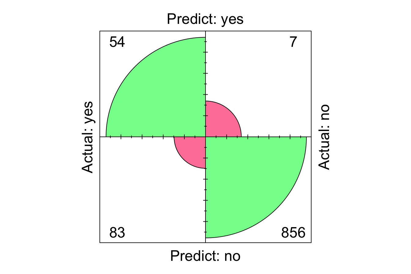
Here, we set reference = "yes" to specify that churn = yes is the positive class, aligning the confusion matrix with our problem focus—correctly identifying customers who actually churned. The confusion matrix summarizes the model’s performance as follows:
-
True Positives (TP): 54 correctly predicted churn cases.
-
True Negatives (TN): 856 correctly predicted non-churn cases.
-
False Positives (FP): 83 incorrectly predicted churn when customers did not churn.
- False Negatives (FN): 7 missed churn cases, predicting them as non-churn.
We can also visualize the confusion matrix using the conf.mat.plot() function:
From the confusion matrix, we compute accuracy and error rate:
\[ \text{Accuracy} = \frac{\text{TP} + \text{TN}}{\text{Total Predictions}} = \frac{54 + 856}{1000} = 0.91 \]
\[ \text{Error Rate} = \frac{\text{FP} + \text{FN}}{\text{Total Predictions}} = \frac{83 + 7}{1000} = 0.09 \]
The accuracy indicates that the model correctly classified 91% of the test set, while 9% of predictions were incorrect.
While accuracy provides a useful summary of overall performance, it does not account for imbalanced datasets or misclassification costs. For example, in customer churn prediction, false negatives (missed churners) might be more costly than false positives (incorrectly predicted churners). Therefore, additional evaluation metrics are necessary to provide a deeper understanding of model performance.
To gain deeper insights into model performance, we now turn to sensitivity, specificity, precision, and recall—metrics that provide a more detailed evaluation of classification outcomes.
8.2 Sensitivity and Specificity
In classification, it’s important to evaluate not just how many predictions are correct overall, but how well the model identifies specific classes. Sensitivity and Specificity are two complementary metrics that focus on the model’s ability to distinguish between positive and negative classes.
These metrics are particularly valuable in cases where class distribution is imbalanced. For example, in fraud detection or rare disease diagnosis, the majority of cases belong to the negative class, which can lead to misleadingly high accuracy. Sensitivity and specificity allow us to separately assess how well the model detects each class.
Sensitivity
Sensitivity (also called Recall in some fields, like information retrieval) measures the model’s ability to correctly identify positive cases. It answers the question:
“Out of all the actual positives, how many did the model correctly predict?”
Mathematically, sensitivity is defined as:
\[
\text{Sensitivity} = \frac{\text{True Positives (TP)}}{\text{True Positives (TP)} + \text{False Negatives (FN)}}
\]
Let’s compute sensitivity for the k-Nearest Neighbors (kNN) model built in Chapter 7, where we predicted whether customers churned (churn = yes). Sensitivity in this case reflects the percentage of churners correctly identified by the model. Using the confusion matrix from Example 8.1:
\[
\text{Sensitivity} = \frac{\text{TP}}{\text{TP} + \text{FN}} = \frac{54}{54 + 7} = 0.885
\]
This means that our model has correctly identified 88.5% of actual churners.
A perfect model would achieve a sensitivity of 1.0 (100%), meaning it correctly identifies all positive cases. However, it’s important to note that even a naïve model that classifies all customers as churners would also achieve 100% sensitivity. This illustrates that sensitivity alone isn’t enough to evaluate a model’s performance—it must be paired with other metrics to capture the full picture.
Specificity
While sensitivity focuses on the positive class, Specificity measures the model’s ability to correctly identify negative cases. It answers the question:
“Out of all the actual negatives, how many did the model correctly predict?”
Specificity is particularly important in situations where avoiding false positives is critical. For example, in spam detection, incorrectly marking a legitimate email as spam (a false positive) can have more severe consequences than missing a few spam messages. Mathematically, specificity is defined as:
\[
\text{Specificity} = \frac{\text{True Negatives (TN)}}{\text{True Negatives (TN)} + \text{False Positives (FP)}}
\]
Using the kNN model and the confusion matrix from Example 8.1, let’s calculate the specificity for identifying non-churners (churn = no):
\[
\text{Specificity} = \frac{\text{TN}}{\text{TN} + \text{FP}} = \frac{856}{856 + 83} = 0.912
\]
This means the model correctly classified 91.2% of the actual non-churners as not leaving the company.
A good classification model should ideally achieve high sensitivity and high specificity, but the relative importance of these metrics depends on the problem domain. For example, in medical diagnostics, sensitivity is often prioritized to ensure no disease cases are missed, while in credit scoring, specificity might take precedence to avoid mistakenly classifying reliable customers as risks.
For the kNN model in Example 8.1, sensitivity is 0.885, while specificity is 0.912. This trade-off may be acceptable in this instance, as identifying churners (sensitivity) might be more critical than avoiding false positives (specificity).
Sensitivity vs. Specificity: A Balancing Act
The trade-off between sensitivity and specificity is often an essential consideration in model evaluation. In many cases, improving one comes at the cost of the other:
- Increasing sensitivity (recall) often leads to more false positives, lowering specificity.
- Increasing specificity reduces false positives but can increase false negatives, lowering sensitivity.
For example, in medical screening, missing a serious disease (false negative) can have severe consequences, so a model with high sensitivity is preferred—even if it results in more false positives (low specificity). In contrast, in email spam filtering, a high false positive rate (flagging important emails as spam) can be frustrating for users. Therefore, a model with high specificity is preferable, even if it occasionally misses spam emails.
This balance is one of the core challenges in classification. The optimal trade-off depends on the business or domain priorities.
In the next section, we will refine this evaluation further by introducing precision and recall. These metrics extend sensitivity and specificity by focusing on the reliability of positive predictions and the ability to capture all relevant positive cases.
8.3 Precision, Recall, and F1-Score
In addition to sensitivity and specificity, precision, recall, and the F1-score offer deeper insights into a classification model’s performance. These metrics are particularly valuable in scenarios with imbalanced datasets, where accuracy alone can be misleading.
Precision, also known as positive predictive value, measures how many of the model’s predicted positives are actually positive. It answers the question:
“When the model predicts positive, how often is it correct?”
Mathematically, precision is defined as:
\[ \text{Precision} = \frac{\text{TP}}{\text{TP} + \text{FP}} \] Precision is especially important in applications where false positives are costly. For example, in fraud detection, flagging legitimate transactions as fraudulent can lead to customer dissatisfaction and unnecessary investigations.
Recall (equivalent to sensitivity) measures the model’s ability to identify positive cases. It answers the question:
“Out of all the actual positives, how many did the model correctly predict?”
Mathematically, recall is defined as:
\[ \text{Recall} = \frac{\text{TP}}{\text{TP} + \text{FN}} \] Recall is particularly useful when missing positive cases (false negatives) has serious consequences, such as failing to diagnose a disease or missing fraudulent transactions. While recall is often used interchangeably with sensitivity in medical diagnostics, it is more commonly referred to as recall in areas like information retrieval, spam detection, and text classification.
Precision vs. Recall: A Trade-Off
There is an inherent trade-off between precision and recall:
- Increasing precision makes the model more selective, reducing false positives but potentially missing true positives (lower recall).
- Increasing recall allows the model to capture more positive cases, reducing false negatives but potentially misclassifying negatives as positives (lower precision).
For example, a medical test for cancer screening should prioritize high recall to ensure that no patient with cancer is missed. However, in email spam detection, precision might be more important to avoid mistakenly classifying important emails as spam.
The F1-Score: Balancing Precision and Recall
To balance this trade-off, the F1-score combines precision and recall into a single metric. It is the harmonic mean of precision and recall, emphasizing their balance: \[ F1 = 2 \cdot \frac{\text{Precision} \cdot \text{Recall}}{\text{Precision} + \text{Recall}} = \frac{2 \cdot \text{TP}}{2 \cdot \text{TP} + \text{FP} + \text{FN}} \] The F1-score is particularly useful in imbalanced datasets, where one class significantly outnumbers the other. Unlike accuracy, it considers both false positives and false negatives, providing a more informative evaluation of a model’s predictive performance.
Now, let’s apply these concepts to the k-Nearest Neighbors (kNN) model from Example 8.1, which predicts customer churn (churn = yes).
First, precision quantifies how often the model’s predicted churners were actual churners:
\[
\text{Precision} = \frac{\text{TP}}{\text{TP} + \text{FP}} = \frac{54}{54 + 83} = 0.394
\]
This means that when the model predicts churn, it is correct in 39.4% of cases.
Next, recall measures how many of the actual churners were correctly identified by the model: \[ \text{Recall} = \frac{\text{TP}}{\text{TP} + \text{FN}} = \frac{54}{54 + 7} = 0.885 \] This shows that the model successfully identifies 88.5% of actual churners.
Finally, the F1-score provides a single measure that balances precision and recall: \[ F1 = \frac{2 \cdot 54}{2 \cdot 54 + 83 + 7} = 0.545 \] The F1-score provides a summary measure of a model’s ability to correctly identify churners while minimizing false predictions.
Choosing the Right Metric
While the F1-score is a valuable metric, it assumes that precision and recall are equally important, which may not always align with the priorities of a particular problem. In medical diagnostics, recall (ensuring no cases are missed) might be more critical than precision. In spam filtering, precision (avoiding false positives) might take precedence to prevent misclassifying important emails.
For a more comprehensive evaluation, we now turn to metrics that assess performance across different classification thresholds. Instead of relying on a fixed decision threshold, these metrics analyze how the model behaves when the classification cutoff changes. This leads us to the Receiver Operating Characteristic (ROC) curve and Area Under the Curve (AUC), which provide insights into how well the model distinguishes between positive and negative cases.
8.4 Taking Uncertainty into Account
When evaluating a classification model, metrics such as precision, recall, and F1-score provide valuable insights into its performance. However, these metrics are based on discrete predictions, where each observation is classified as either positive or negative. This approach overlooks an important factor: uncertainty. Many classification models, including k-Nearest Neighbors (kNN), can output probability scores instead of fixed labels, offering a measure of confidence for each prediction.
These probability scores allow us to fine-tune how decisions are made by adjusting the classification threshold. By default, a threshold of 0.5 is commonly used, meaning that if a model assigns a probability of 50% or higher to the positive class, the instance is classified as positive; otherwise, it is classified as negative. However, this default may not always be ideal. Adjusting the threshold can significantly impact model performance, allowing it to better align with business goals or domain-specific needs. For example, in some applications, missing true positives (false negatives) is far costlier than misclassifying negatives as positives—or vice versa. By experimenting with different thresholds, we can explore trade-offs between sensitivity, specificity, precision, and recall to optimize model decisions.
Example 8.2 Let’s revisit the kNN model from Example 8.1, which predicts customer churn (churn = yes). This time, instead of making discrete predictions, we will obtain probability scores for the positive class (churn = yes) by setting the type parameter to "prob" in the kNN() function:
kNN_prob = kNN(formula = formula, train = train_set,
               test = test_set, k = 5, scaler = "minmax",
               type = "prob")
kNN_prob[1:10, ]
      yes  no
   6  0.4 0.6
   10 0.2 0.8
   17 0.0 1.0
   19 0.0 1.0
   21 0.0 1.0
   23 0.2 0.8
   29 0.0 1.0
   31 0.0 1.0
   36 0.0 1.0
   40 0.0 1.0
The output displays the first 10 probability scores for each class: the first column corresponds to churn = yes, while the second column corresponds to churn = no. For instance, if the first row has a probability of 0.4, the model is 40% confident that the customer will churn, while a probability of 0.6 suggests a 60% confidence that the customer will not churn.
To demonstrate the impact of threshold selection, we compute confusion matrices at two different thresholds: the default 0.5 and a stricter 0.7 threshold.
conf.mat(kNN_prob[, 1], actual_test, reference = "yes", cutoff = 0.5)
          Actual
   Predict yes  no
       yes  54   7
       no   83 856
conf.mat(kNN_prob[, 1], actual_test, reference = "yes", cutoff = 0.7)
          Actual
   Predict yes  no
       yes  22   1
       no  115 862
At a threshold of 0.5, the model classifies a customer as a churner if the probability of churn is at least 50%. This confusion matrix aligns with the one in Example 8.1. However, when we raise the threshold to 0.7, the model becomes more conservative, requiring at least 70% confidence before classifying an instance as churn. This shifts the balance between true positives, false positives, and false negatives:
- Lowering the threshold increases sensitivity, catching more true positives but potentially leading to more false positives.
- Raising the threshold increases specificity, reducing false positives but at the risk of missing more true positives.
Adjusting the threshold is particularly useful in cases where the cost of false positives and false negatives is not equal. For example, in fraud detection, false negatives (missing fraudulent transactions) can be costly, so lowering the threshold to prioritize recall (sensitivity) might be preferable. Conversely, in spam detection, false positives (flagging legitimate emails as spam) are undesirable, so a higher threshold might be used to prioritize precision.
Choosing an Optimal Threshold
Fine-tuning the threshold allows us to align model behavior with business or domain-specific requirements. Suppose we need a sensitivity of at least 90% to ensure that most churners are detected. By iteratively adjusting the threshold and recalculating sensitivity, we can determine the cutoff that achieves this goal. This process is known as setting an operating point for the model.
However, threshold adjustments always involve trade-offs. A lower threshold improves recall but may reduce precision by increasing false positives. Conversely, a higher threshold increases precision but may lower recall by missing true positives. For instance, setting a threshold of 0.9 might achieve near-perfect specificity but could miss most actual churners.
While manually tuning the threshold can be helpful, a more systematic approach is needed to evaluate model performance across all possible thresholds. This leads us to the Receiver Operating Characteristic (ROC) curve and Area Under the Curve (AUC), which provide a comprehensive way to assess a model’s ability to distinguish between classes.
8.5 ROC Curve and AUC
While adjusting classification thresholds provides valuable insights, it is often impractical for systematically comparing models. Additionally, sensitivity, specificity, precision, and recall evaluate a model at a fixed threshold, offering only a snapshot of performance. Instead, we need a way to assess performance across a range of thresholds, revealing broader trends in model behavior. Models with similar overall accuracy may perform differently—one might excel at detecting positive cases but misclassify many negatives, while another might do the opposite. To systematically evaluate a model’s ability to distinguish between positive and negative cases across all thresholds, we use the Receiver Operating Characteristic (ROC) curve and its associated metric, the Area Under the Curve (AUC).
The ROC curve visually represents the trade-off between sensitivity (true positive rate) and specificity (true negative rate) at various classification thresholds. It plots the True Positive Rate (Sensitivity) against the False Positive Rate (1 - Specificity). Originally developed for radar signal detection during World War II, the ROC curve is now widely used in machine learning to assess classifier effectiveness.
Figure 8.1 illustrates key ROC curve characteristics. The vertical axis represents True Positive Rate (Sensitivity), while the horizontal axis represents False Positive Rate (1 - Specificity). Three scenarios are highlighted:
-
Optimal Performance (Green Curve): A model with near-perfect performance passes through the top-left corner, achieving both high sensitivity and high specificity.
-
Good Performance (Blue Curve): A well-performing but imperfect model remains closer to the top-left corner than to the diagonal line.
- Random Classifier (Diagonal Line): The gray dashed diagonal represents a model with no predictive power, classifying randomly. A model close to this line provides little practical utility.
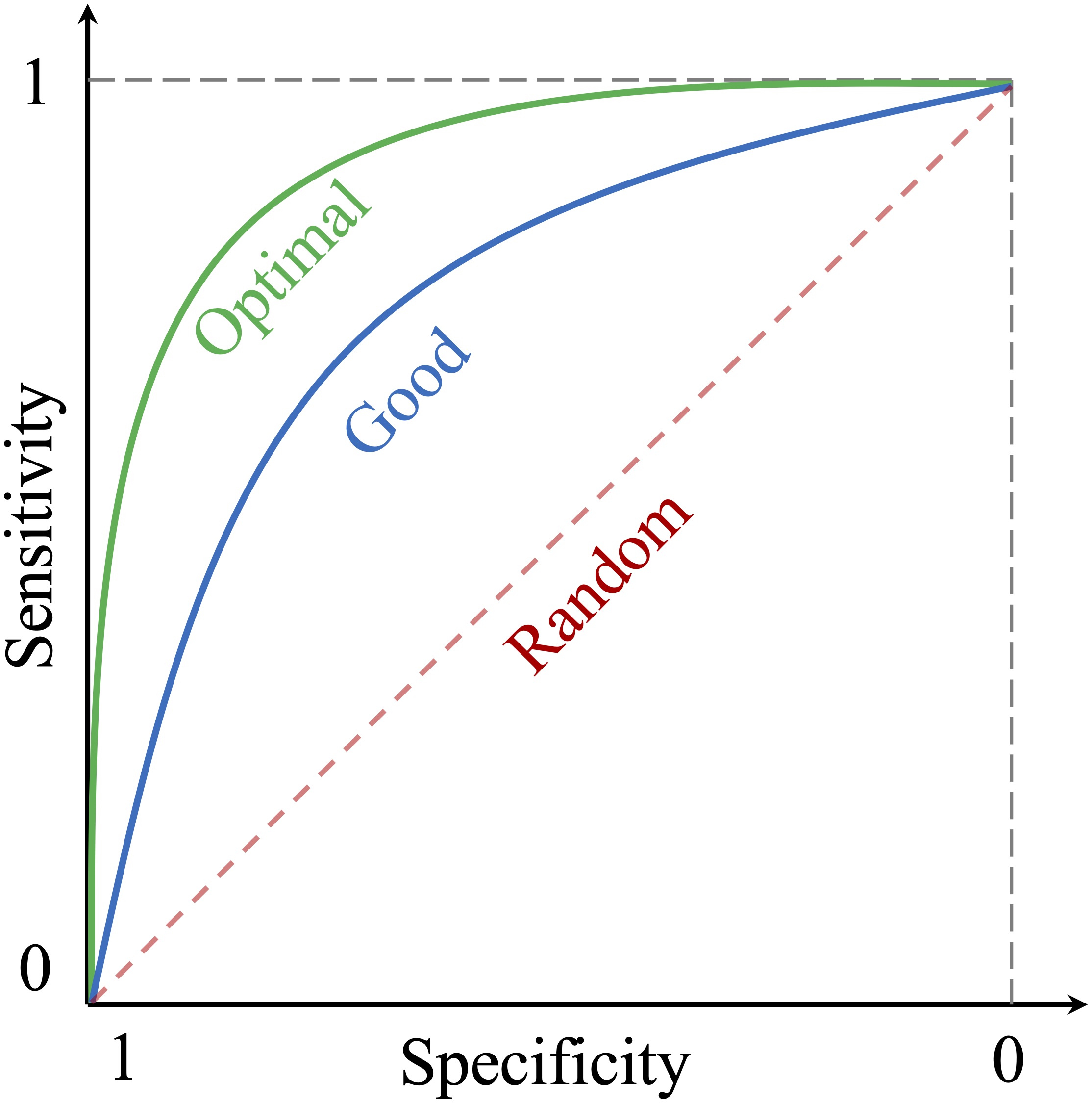
Figure 8.1: The ROC curve illustrates the trade-off between sensitivity and specificity at different thresholds. The diagonal line represents a classifier with no predictive value (gray dashed line), while the curves represent varying levels of performance: green for optimal and blue for good.
Each point on the ROC curve corresponds to a specific threshold. As the threshold varies, the True Positive Rate (Sensitivity) and False Positive Rate (1 - Specificity) change, tracing the curve. A curve that remains close to the top-left corner indicates better performance, as the model achieves high sensitivity while minimizing false positives. However, moving along the curve reflects different trade-offs between sensitivity and specificity. Choosing an optimal threshold depends on the application:
- In medical diagnostics, maximizing sensitivity ensures no cases are missed, even if it results in some false positives.
- In fraud detection, prioritizing specificity prevents legitimate transactions from being falsely flagged.
To construct the ROC curve, a classifier’s predictions are sorted by their estimated probabilities for the positive class. Starting from the origin, each prediction’s impact on sensitivity and specificity is plotted. Correct predictions (true positives) result in vertical movements, while incorrect predictions (false positives) lead to horizontal shifts.
Example 8.3 Let’s apply this concept to the k-Nearest Neighbors (kNN) model from Example 8.2, where we obtained probabilities for the positive class (churn = yes). We’ll use these probabilities to generate the ROC curve for the model. The pROC package in R simplifies this process. Ensure the package is installed using install.packages("pROC") before proceeding.
To create an ROC curve, two inputs are needed: the estimated probabilities for the positive class and the actual class labels. Using the roc() function from the pROC package, we generate the ROC curve object:
We can then visualize the ROC curve using the ggroc() function from the pROC package or the plot() function for a basic display. Here’s the ROC curve for the kNN model:
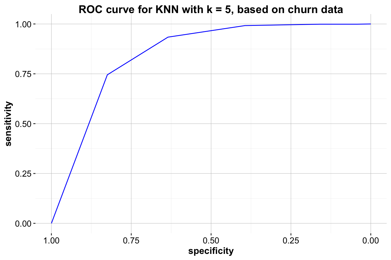
Figure 8.2: ROC curve for KNN with k = 5, based on churn data.
The ROC curve visually demonstrates the model’s performance across different thresholds. A curve closer to the top-left corner indicates better performance, as it achieves high sensitivity and specificity. The diagonal line represents a random classifier, serving as a baseline for comparison. In this case, the kNN model’s ROC curve is much closer to the top-left corner, suggesting strong performance in distinguishing between churners and non-churners.
Area Under the Curve (AUC)
Another critical metric derived from the ROC curve is the Area Under the Curve (AUC), which quantifies the overall performance of the model. AUC represents the probability that a randomly chosen positive instance will have a higher predicted score than a randomly chosen negative instance. Mathematically, AUC is computed as:
\[ \text{AUC} = \int_{0}^{1} \text{TPR}(t) \, d\text{FPR}(t) \]
where \(t\) represents the threshold, reinforcing that AUC measures the model’s ability to rank positive cases above negative ones across all possible thresholds.
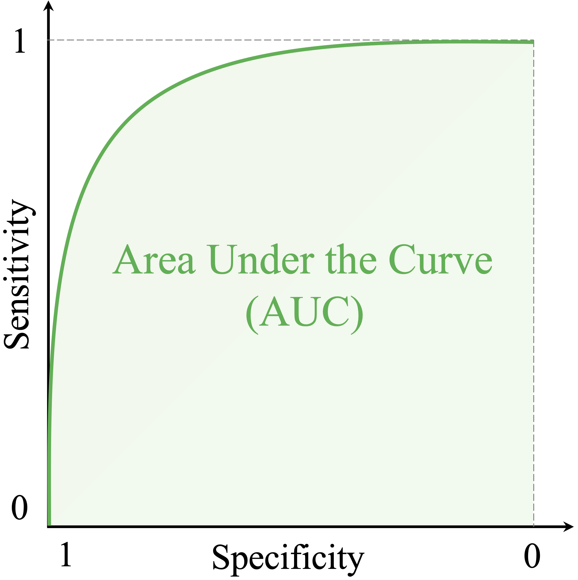
Figure 8.3: The AUC summarizes the ROC curve into a single number, representing the model’s ability to rank positive cases higher than negative ones. AUC = 1: Perfect model. AUC = 0.5: No better than random guessing.
AUC values range from 0 to 1, where a value of 1 indicates a perfect classifier with ideal discrimination between classes, while a value of 0.5 suggests no better performance than random guessing. AUC values between 0.5 and 1 represent varying levels of model performance, with higher values reflecting better separation between positive and negative cases.
For the kNN model, we compute the AUC using the auc() function from the pROC package:
The AUC value for this model is 0.849, meaning the model ranks positive cases higher than negative ones with a probability of 0.849.
In summary, the ROC curve and AUC provide a comprehensive way to evaluate classification models, enabling comparisons across multiple models and identifying optimal thresholds for specific tasks. These tools are particularly valuable for imbalanced datasets, as they capture the trade-offs between sensitivity and specificity across all classification thresholds. By combining these insights with metrics like precision, recall, and the F1-score, we can develop a deeper understanding of model performance and select the best approach for the given problem.
In the next section, we extend our discussion to multi-class classification, where the target variable has more than two possible categories, requiring modifications to standard evaluation metrics.
8.6 Metrics for Multi-Class Classification
So far, we have focused on binary classification, where the target variable has two categories. However, many real-world problems involve multi-class classification, where the target variable can belong to three or more categories. Examples include classifying species in ecological studies or identifying different types of vehicles. Evaluating such models requires extending performance metrics to handle multiple categories effectively.
In multi-class classification, the confusion matrix expands to include all classes, with each row representing the actual class and each column representing the predicted class. Correct predictions appear along the diagonal, while off-diagonal elements indicate misclassifications. This structure highlights which classes the model struggles to distinguish.
Metrics such as accuracy, precision, recall, and F1-score can be adapted for multi-class problems. Instead of evaluating a single positive class, we assess each class as if it were the positive class while treating all other classes as negative. This one-vs-all (also known as one-vs-rest) approach allows the calculation of precision, recall, and F1-score for each class separately. To summarize overall performance, different averaging techniques are used:
-
Macro-average: Computes the unweighted mean of the metric across all classes, treating each class equally. This is useful when all classes are of equal importance, regardless of their frequency in the dataset.
-
Micro-average: Aggregates predictions across all classes before computing the metric, giving more weight to larger classes. This is particularly useful when the dataset has an uneven class distribution, as it provides a more representative measure of overall model performance.
- Weighted-average: Similar to macro-averaging but weights each class’s metric by its frequency in the dataset. This ensures that larger classes contribute proportionally while preventing minority classes from being overshadowed.
These averaging methods ensure a fair evaluation, particularly in imbalanced datasets where some classes may have significantly fewer samples than others.
While metrics such as the ROC curve and AUC are primarily designed for binary classification, they can be extended to multi-class problems using strategies like one-vs-all, where an ROC curve is generated for each class against the others. However, in most practical applications, macro-averaged or weighted-averaged F1-score provides a concise and meaningful summary of multi-class model performance.
By applying these metrics, we can assess how well the model performs across all categories, identify weaknesses in specific classes, and ensure that the evaluation aligns with the problem’s objectives. The next section explores evaluation metrics for regression models, where the target variable is continuous rather than categorical.
8.7 Evaluation Metrics for Continuous Targets
So far, we have focused on evaluating classification models, which predict discrete categories. However, many real-world problems involve predicting continuous target variables, such as house prices, stock market trends, or weather forecasts. These tasks require regression models, which are assessed using metrics specifically designed for continuous data.
A widely used evaluation metric for regression models is the Mean Squared Error (MSE): \[ \text{MSE} = \frac{1}{n} \sum_{i=1}^{n} (y_i - \hat{y}_i)^2 \] where \(y_i\) represents the actual value, \(\hat{y}_i\) is the predicted value, and \(n\) is the number of observations. MSE calculates the average squared difference between predicted and actual values, with larger errors contributing disproportionately due to squaring. As a result, MSE is particularly sensitive to outliers. Lower values indicate better model performance, with zero representing a perfect fit.
While MSE is useful, its sensitivity to large errors may not always be desirable. A more robust alternative is the Mean Absolute Error (MAE), which measures the average absolute difference between predicted and actual values: \[ \text{MAE} = \frac{1}{n} \sum_{i=1}^{n} |y_i - \hat{y}_i| \] Unlike MSE, MAE treats all errors equally, making it less sensitive to extreme values and easier to interpret. It is particularly useful when the target variable has a skewed distribution or when outliers are present.
Another key metric for evaluating regression models is the \(R^2\) score, or coefficient of determination. The \(R^2\) score measures the proportion of variance in the target variable that the model explains. It is defined as: \[ R^2 = 1 - \frac{\sum (y_i - \hat{y}_i)^2}{\sum (y_i - \bar{y})^2} \] where \(\bar{y}\) is the mean of the actual values. The \(R^2\) score ranges from 0 to 1, where higher values indicate a better fit. An \(R^2\) value of 1 means the model perfectly predicts the target variable, while a value of 0 suggests the model performs no better than simply predicting the mean of the target variable.
These metrics provide different perspectives on model performance. MSE is useful when penalizing larger errors is important, MAE is preferable for interpretability and robustness to outliers, and \(R^2\) helps quantify how well the model explains variability in the data. The choice of metric depends on the specific problem and goals. In Chapter 10, we will explore these evaluation metrics in greater depth, alongside various regression modeling techniques.
8.8 Key Takeaways from Model Evaluation
In this chapter, we explored the critical step of model evaluation, which determines how well a model performs and whether it meets the requirements of the problem at hand. Starting with foundational concepts, we examined metrics for evaluating classification models, including binary, multi-class, and regression models.
Key Takeaways
Binary Classification Metrics:
We began by understanding the confusion matrix, which categorizes predictions into true positives, true negatives, false positives, and false negatives. From this, we derived key metrics such as accuracy, sensitivity (recall), specificity, precision, and the F1-score, each offering different perspectives on model performance.Threshold Tuning:
Recognizing the impact of probability thresholds on model predictions, we discussed how adjusting thresholds can help align a model with specific goals, such as maximizing sensitivity for critical applications or prioritizing specificity to avoid false positives.ROC Curve and AUC:
To evaluate model performance across all possible thresholds, we introduced the Receiver Operating Characteristic (ROC) curve and the Area Under the Curve (AUC). These tools provide a systematic and visual way to assess a model’s ability to distinguish between classes, making them particularly useful for comparing multiple models.Multi-Class Classification:
For classification problems involving more than two classes, we extended metrics such as precision, recall, and the F1-score by calculating per-class metrics and aggregating them using methods such as macro-average, micro-average, and weighted-average. These approaches ensure a balanced evaluation, especially when dealing with imbalanced datasets.Regression Metrics:
For problems involving continuous target variables, we introduced evaluation metrics such as mean squared error (MSE), mean absolute error (MAE), and the \(R^2\) score. These metrics allow for assessing prediction accuracy while accounting for trade-offs between penalizing large errors (MSE) and ensuring interpretability (MAE).
Closing Thoughts
This chapter emphasized that no single metric can fully capture a model’s performance. Instead, evaluation should be guided by the specific goals and constraints of the problem, balancing trade-offs such as accuracy versus interpretability and false positives versus false negatives. Proper evaluation ensures that a model is not only accurate but also actionable and reliable in real-world applications.
By mastering these evaluation techniques, you are now equipped to critically assess model performance, optimize thresholds, and select the right model for the task at hand. In the following chapters, we will build on this foundation to explore advanced modeling techniques and their evaluation in greater detail.
8.9 Exercises
Conceptual Questions
- Why is model evaluation important in machine learning?
- Explain the difference between training accuracy and test accuracy.
- What is a confusion matrix, and why is it useful?
- How does the choice of the positive class impact evaluation metrics?
- What is the difference between sensitivity and specificity?
- When would you prioritize sensitivity over specificity? Provide an example.
- What is precision, and how does it differ from recall?
- Why do we use the F1-score instead of relying solely on accuracy?
- Explain the trade-off between precision and recall. How does changing the classification threshold impact them?
- What is an ROC curve, and how does it help compare different models?
- What does the Area Under the Curve (AUC) represent? How do you interpret different AUC values?
- How can adjusting classification thresholds optimize model performance for a specific business need?
- Why is accuracy often misleading for imbalanced datasets? What alternative metrics can be used?
- What are macro-average and micro-average F1-scores, and when should each be used?
- Explain how multi-class classification evaluation differs from binary classification.
- What is Mean Squared Error (MSE), and why is it used in regression models?
- How does Mean Absolute Error (MAE) compare to MSE? When would you prefer one over the other?
- What is the \(R^2\) score in regression, and what does it indicate?
- Can an \(R^2\) score be negative? What does it mean if this happens?
- Why is it important to evaluate models using multiple metrics instead of relying on a single one?
Hands-On Practice: Evaluating Models with the Bank Dataset
For these exercises, we will use the bank dataset from the liver package. The dataset contains information on customer demographics and financial details, with the target variable deposit indicating whether a customer subscribed to a term deposit.
Load the necessary package and dataset:
library(liver)

# Load the dataset
data(bank)

# View the structure of the dataset
str(bank)
   'data.frame':    4521 obs. of  17 variables:
    $ age      : int  30 33 35 30 59 35 36 39 41 43 ...
    $ job      : Factor w/ 12 levels "admin.","blue-collar",..: 11 8 5 5 2 5 7 10 3 8 ...
    $ marital  : Factor w/ 3 levels "divorced","married",..: 2 2 3 2 2 3 2 2 2 2 ...
    $ education: Factor w/ 4 levels "primary","secondary",..: 1 2 3 3 2 3 3 2 3 1 ...
    $ default  : Factor w/ 2 levels "no","yes": 1 1 1 1 1 1 1 1 1 1 ...
    $ balance  : int  1787 4789 1350 1476 0 747 307 147 221 -88 ...
    $ housing  : Factor w/ 2 levels "no","yes": 1 2 2 2 2 1 2 2 2 2 ...
    $ loan     : Factor w/ 2 levels "no","yes": 1 2 1 2 1 1 1 1 1 2 ...
    $ contact  : Factor w/ 3 levels "cellular","telephone",..: 1 1 1 3 3 1 1 1 3 1 ...
    $ day      : int  19 11 16 3 5 23 14 6 14 17 ...
    $ month    : Factor w/ 12 levels "apr","aug","dec",..: 11 9 1 7 9 4 9 9 9 1 ...
    $ duration : int  79 220 185 199 226 141 341 151 57 313 ...
    $ campaign : int  1 1 1 4 1 2 1 2 2 1 ...
    $ pdays    : int  -1 339 330 -1 -1 176 330 -1 -1 147 ...
    $ previous : int  0 4 1 0 0 3 2 0 0 2 ...
    $ poutcome : Factor w/ 4 levels "failure","other",..: 4 1 1 4 4 1 2 4 4 1 ...
    $ deposit  : Factor w/ 2 levels "no","yes": 1 1 1 1 1 1 1 1 1 1 ...
Data Preparation
- Load the bank dataset and identify the target variable and predictor variables.
- Check for class imbalance in the target variable (deposit). How many customers subscribed to a term deposit versus those who did not?
- Apply one-hot encoding to categorical variables using
one.hot().
- Partition the dataset into 80% training and 20% test sets using
partition().
- Validate the partitioning by comparing the class distribution of deposit in the training and test sets.
- Apply min-max scaling to numerical variables to ensure fair distance calculations in kNN models.
Model Training and Evaluation
- Train a kNN model using the training set and predict deposit for the test set.
- Generate a confusion matrix for the test set predictions using
conf.mat(). Interpret the results.
- Compute the accuracy, sensitivity, and specificity of the kNN model.
- Calculate precision, recall, and the F1-score for the model.
- Use
conf.mat.plot()to visualize the confusion matrix.
- Experiment with different values of \(k\) (e.g., 3, 7, 15) and compare the evaluation metrics.
- Plot the ROC curve for the kNN model using the pROC package.
- Compute the AUC for the model. What does the value indicate about performance?
- Adjust the classification threshold (e.g., from 0.5 to 0.7) and analyze how it impacts sensitivity and specificity.
Critical Thinking and Real-World Applications
- Suppose a bank wants to minimize false positives (incorrectly predicting a customer will subscribe). How should the classification threshold be adjusted?
- If detecting potential subscribers is the priority, should the model prioritize precision or recall? Why?
- If the dataset were highly imbalanced, what strategies could be used to improve model evaluation?
- Consider a fraud detection system where false negatives (missed fraud cases) are extremely costly. How would you adjust the evaluation approach?
- Imagine you are comparing two models: one has high accuracy but low recall, and the other has slightly lower accuracy but high recall. How would you decide which to use?
- If a new marketing campaign resulted in a large increase in term deposit subscriptions, how might that affect the evaluation metrics?
- Given the evaluation results from your model, what business recommendations would you make to a financial institution?